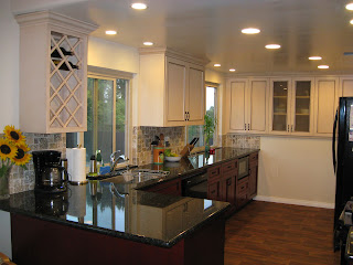
We recently finished our kitchen remodel -- Hallelujah!!! It took about 8 weeks to be completely done, longer than I planned. But I learned that things don't always go as I plan - go figure. I had it all planned out - cabinets would be installed around April 16 - wrong! I spent several weeks walking on concrete and plywood floors with dust everywhere and my allergies in full bloom. Our "kitchen sink" was the downstairs bathroom. We BBQ-ed when we could; ate out often, but that got old. Thankfully, Fresh and Easy was down the street and they have delicious freshly-made meals that you can pop in a microwave.
Everyone who has ever done a remodel goes through the same thing. I kept reminding myself that this is only temporary and I would have the rest of my life to enjoy my new kitchen.
The remodel turned out GREAT! I still walk into my kitchen and do a double-take; I can't believe this is my kitchen. I want to share the pictures, because I am so happy with the way things turned out. I used to hate my cracker-box-of-a-kitchen, but now I feel as if I have the biggest kitchen ever.
I have before and after pictures, so you can see the whole story.
My kitchen sink with the missing doors. They were disgusting so I removed them and added the curtains.
The new-and-improved kitchen sink.
The view looking toward the dining room.
The same view, now looking into the living room. We knocked out the wall.
The stove area.
The stove area after. We knocked out another wall. We had to add a support post to hold up the ceiling.
The pantry - before.
The pantry - after.
Pull-out drawers in the pantry -- YAY!! Love these.
Here is a kitchen cart I bought years ago to add more "counter space". This area was actually designed as an "eat-in" kitchen. This was a total waste of space.
Same area now with built-in cabinets and more counter space. My husband figured we added 26 square feet of counter space. To save counter space, we installed the microwave under the counter. I got this idea in the kitchen showroom area at Lowe's actually. The microwave is on a pull-out shelf so we can get behind it to clean.
I used Elfa Shelving to create more storage. It always looked like a mess.
Now the wall is cabinets, cabinets, cabinets - and they are nice and deep. It created lots of storage space.
Another view of the same wall.
View from the entry looking toward the kitchen. Behind that wall/bookshelves is the stove and hood.
Same view, but no more wall. We added a bar and stools for more seating. Now we can have conversations with guests while we work in the kitchen. Before, everyone just crowded into the small kitchen and got in the way.
View from the living room looking toward the kitchen.
Same view from the living room now opened up, making everything look so much larger.
View standing in the dining room and looking toward the kitchen sink area.
Same view as above, now opened up without the wall. The wine rack in the upper left-hand corner is now filled! :-)
Looking toward the stove from the dining room.
Same view, now you can see all the way through to the stairs.
I love the look of the red cabinets on the bottom and the lighter color above. I felt that all red cabinets would look too heavy and make my already-small kitchen look smaller.
The red stain with the black glazing turned out beautiful. It reminds me of a very good glass of red wine.
The below picture was the inspiration for my color scheme. Although the colors in my new kitchen turned out much richer and deeper.
Below are pictures of the little extras I added that make the kitchen all the better.
Jenn-Air slide-in downdraft convection range. I chose the downdraft because I didn't want a huge hood hanging over the stove. Jenn-Air was the only model available that had a downdraft AND I could afford.
Pull-out spice cabinet. This thing is awesome!
Rev-a-Shelf pots/pans organizer.
Rev-a-Shelf half-moon lazy susan for the blind corner.
Organization for cookie sheets, etc. Another great addition.
I use this pull-out drawer as a small appliance "garage".
That's about it. I'd love to hear your comments. Regardless of what anyone says, I love the way the remodel turned out and look forward to many years enjoying my new kitchen,


